Welcome

thanks for visiting! As this is my first EVER blog, I think some info on my background is important. My name is Nicole, I am a mother of 2, wife of 9 years and interior designer. My life as a designer has been interesting thus far. I have worked for a large builder (who shall remain nameless ;-) designing model homes as well as an interior designer for Drexel Heritage in Colorado Springs. I have always worked for someone else and am ready to try this thing out on my own. As I find myself currently unemployed (urg) I dont see a better time than now to start the ball rolling on my passion for design. You can expect me to provide tips, tricks, answer questions and share with you the many wonderful design finds I come across. So please please if there is something you are interested in knowing, let me know. and here we go......

Saturday, January 30, 2010

Design is Delish...


Design makes me feel all sorts of things, today, its hungry!!!! so often people think of "natural" colors as earthy browns, mossy greens, sand, etc. all of these are fantastic, neutral and wonderful, they are all necessities to all designers.  Neutrals are essential in a design, but ALL neutrals can sometimes be lackluster

I say, what about the natural COLORS, ones that are bright and saturated, and sometimes intense:

Greenmarket is one of pantones color palettes for 2010,

and it rocks

the palettes colors are as follows: Tomato Puree, Vanilla Ice, Chutney, Paprika, Dijon, Apple Green, Super Lemon, Peach Blossom and Beaujolais.
hungry yet, I thought so...

"The need for healthier and more artisanal foods has grown from traditional farmers’ markets to greenmarkets. Found on country roads or urban lots, these visually appealing and tastetempting sites invite us to stop and sample a broader and more diverse selection of goods and goodies. From Tomato Puree and Beaujolais with the tang of Super Lemon or bite of Apple Green, to the more exotic flavors of Dijon, Paprika and Chutney, Greenmarket contains representational hues that entice and appeal to both the eyes and the taste buds."


Look at the color of this sofa, so yummy, and a bold grape patterned chair, a fantastic complement


Dont be afraid to combine two saturated colors, red, yellow green and teal complete a classic tertiary color scheme, take an apple green and grape together (as seen above), try mixing other saturated complements like raspberry and canary or teal and tangerine


Depending on the color temperature of the hue you choose
you can dramatically change the personality of your space, take a spicier yellow for an elegant, classic space, or a brighter yellow paired with contrasting black and white for a fun and dramatic design


Raspberry sorbet on the walls is so feminine and gorgeous, a tomatoe red curtain paired with greys, black, white, and equal parts texture and pattern is effortlessly pulled together


www.moderndesignblog.com

www.countryliving.com

www.interior-design-ideas-now.com

rhid-baked.blogspot.com

www.washingtonpost.com

www.creativesessionsdesign.com/blog/

Thursday, January 28, 2010

Why Perch???

So friends, already I'm being asked the question, why perch?  The inspiration behind the name I chose to represent my design style is simple.  If you look the word up in the dictionary you get: "an elevated place for resting or sitting" and "a place that is secure, advantageous and prominant."  I also love that a perch is usually very organic in shape and geometric in shape at the same time, the best of both worlds.  With this, I want to share some finds that translate literally into the name I chose to represent myself in the design community.  Enjoy:

these designs are from pottery barns spring line.  I love the antique feel of the fern prints and the bird cages.  both are available for under 50$.  I also fell in love with a vintage canary print available at pottery barn, but at almost 300$ I knew there was a better solution out there.  I found this adorable blue bird print (and some other equally cute ones) at http://www.vintageprintable.com/ downloads are free, this site rocks.


so if you dont know, you soon will, I have a certain love for vintage prints and LOVE color.  This alexander henry fabric is just darling.  Being that it is a cotton print, it is not suitable for upholstery projects, however, order a yard and wrap it around a canvas for instant adorable wall art. 

I also love anything that is made by hand, these vinyl wall stickers are so adorable, and when you tire of them, just peel them off the wall.  These stores can be found at http://www.etsy.com/ , search circlelinestudios, lovesticky and expressingyou, all of these are under 50$


Larkspur Residential Project


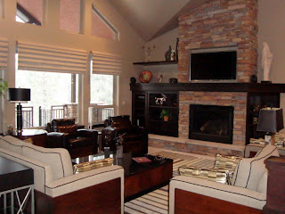
This is a design I did last year, the premise was to create a design that was cozy and not at all your typical mountain property interior