Now dont get me wrong, these two bedrooms are pretty enough, but they are definately not winning any crowns any time soon my friends...
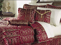
DONT: buy a bed in a bag. Ok I know a LOT of people that have a bed in a bag, and while it isn't the worst design faux pas you can make; still, there are better ways to impart a great style in your space. First pick one thing you love, be it a throw pillow, comforter, drapery and work from there. Add in coordinating fabrics, mix textures, add different patterns and the end result will be more couture than off the rack. Take a peak at the Bahama mama ish bedding to the left. Wowsa, a palm tree threw up in that room. DONT do this... or this little red and gold brocade number
Instead, make your room speak to your style and individuality, dont fall victim to the "easy" way to "design" your space; make more of a statement than that, you'll thank yourself. Check out these rooms that have some moxie:
 DONT: purchase a bedroom/living room/dining room "suite." Ok, this is one I'm guilty of too and I kick myself in the butt for it. I hate when I go into my bedroom and I have matching nightstands, armoire and bureau. So irritating for me; however, I've added my own personal touches to other areas of my own bedroom to make it my own. Instead of buying a "suite" purchase the bed, or create your own headboard, buy a few functional side tables that have the right height and width to suit your needs. these pieces need to be functional as well as work with the design. Now think about your storage needs. Do you need an armoire for the tv? do you need a large dresser to store folded clothes? Can you fit folded items in a piece in your closet? Do you need additional seating in you room? Think about your function first and then add in pieces that you love to keep it feeling lively. The same goes for your living and dining spaces. Find a piece that has history and character at a consignment shop, garage sale or antique market. You can always refurbish it and make it your own; and you'll love having a piece with more of a past than a mass produced item. Take a look at the sectional sofa, bordered area rug, some kind of drapery and a single throw pillow in the photo above. I think I just named everything in this space. I'm all for minimalist design, but scuse me while I take a nap. Here are some more donts for you:
Do they match? YES! Are they interesting? NO
Now this living space is more like it. There is pattern, texture, color, occassional tables that are so adorable I want to know where they came from. The scale is great, walls are interesting; the entire design works. The designer created a linear line with the height of the sofa and chairs, and kept it soft with more curvilinear shapes in the tables; as well as the addition of flowers and plants. The shocking blue velvet on the sofa is the showstopper, with a few green pillows and grey upholstered chairs. Nothing is overwhelming in color, pattern, texture or scale. That is why this space works, everything is done in proper proportion.
Stay tuned for the next Design DONT coming in the next blog.
http://designamour.com/2008/11/11/paint-it-black/
http://www.zimbio.com/Modern+Wall+Stencils
www.paintquality.co.za/.../aw2006/Tr4_cont.html
http://www.philippineinteriordesign.com/picture_bedroom6.htm
http://home-interior.blogspot.com/2008/07/make-small-rooms-look-bigger-part-one.html
http://oldworldcharm-oldworldcharm.blogspot.com/2009/11/monocrome-interior-design-neutral-but.html
http://www.furnish.com/
http://www.houseofnubian.com/id-1343//ImgUpload/P_H0P07_1768687.JPG
www.bed-in-a-bag-sets.com/
www.styleathome.com/
https://www.decorpad.com/relatedPhotos.htm?photoId=13115¤tPage=8
http://www.channel4.com/4homes/design-style/design-byspace/bedroom/country-style-bedroom-design-ideas-09-03-02_p_19.html


Thanks so much for this post!! As much as bed in a bag has felt like the easier way out, I can't stand when things match! Thanks for the suggestions on how to create a unique, personalized space that doesn't have to match!!
ReplyDelete--Alicia--
You are welcome Alicia! It is easier to purchase everything all in one bag, but it makes your space feel less interesting than it could. I shop with my inspiration, be it fabric, a pillow, a paint color etc. and pick out things that go well with it. Thanks for the comment!
ReplyDeleteColie